Prior to the Bionic updates, Heading text should be pure black (#000000), whereas body text should be off-black (#303030).
In the new theme headers are #242425 and body text is #404040.
Below is a list of all brand colours, along with the 6 digit hex code and the scss variable which is used across the theme to call it.
Variations
Secondary and Tertiary Colours
There are two further colours, a green and a blue, which compliment the orange but should be reserved for specific use cases. e.g:
- More complex designs that would benefit from more than one colour
- To highlight and unify a limited series of podcasts or articles which are somehow related to each other but stand separate to the majority.
In the original version of the bionic theme, as well as bitesize orange, there were secondary and tertiary colors, but these have been refined to the colors listed above.
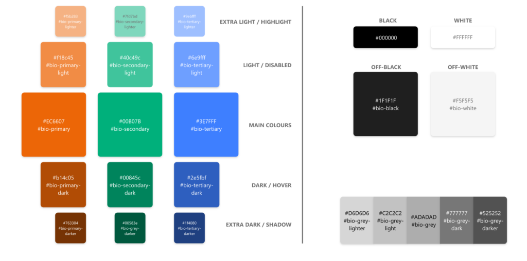
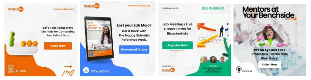
The three colours are utilised in our social media comms, to identify different types of content, as follows:
- For links to articles, the orange is used
- For links to downloadables, the blue is used
- For links to Webinars and Masterclasses, the green is used
- For podcasts, white is used
Light and dark
For each of the three colours, there are two light (‘light’ and ‘lighter’) and two dark (‘dark’ and ‘darker’) variations. The light and lighter can be calculated programmatically by adding 25% and 50% white respectively to the main colour. Similarly, the dark and darker can be calculated by adding 25% and 50% black respectively.
Specific use cases
Buttons in any of the three main colours should use the ‘dark’ variant as a hover or active state. If the button is disabled, this should be illustrated by use of the ‘light’ variant.