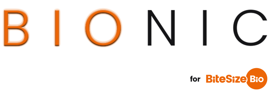
There are three main versions of the logo for use universally.
The full logo, with strapline
The full logo without strapline
The Bio Roundel
Useage
Context should be considered when deciding which variant to use. The default choice in most instances should be the full logo without strapline.
The full logo with strapline should only be used where it could be considered the top level of a piece of content. e.g. The header of a website or the front cover of an ebook. For things like event videos, the header of the events site would be the top level, therefore videos would only use the version without strapline.
- As a rough guide, if this is realistically the first time a user might encounter the logo in their current user journey, use the version with strapline. Otherwise, use the version without.
- Regardless of whether or not it is the top level of the logo, if it will display at less than 150px wide, the version without strapline should be used, for legibility reasons.
- If the space is less than 100px wide and either square or portrait, the bio roundel should be used.
- In all cases, regardless of size, if the space is a circle (e.g. a round profile picture box), the roundel should be used.
Colour variants
In most instances, the primary orange logo should be used. Versions have also been created in white, black and grey, for use where appropriate (e.g. against a background other than white). Only solid colours should be used. No gradients.
The secondary and tertiary colours should never be used for the logo.
Dynamic logo
The logo is included in the theme with a set of usage rules already applied. A dynamic SVG version of the logo has been created and included in the theme with many of these rules already applied. All individual elements of the logo have been isolated and given individual ID’s. This allows for variations to be controlled programmatically (e.g. turn the strapline on or off; change the colour on mouse hover). More details on that can be found here.
